
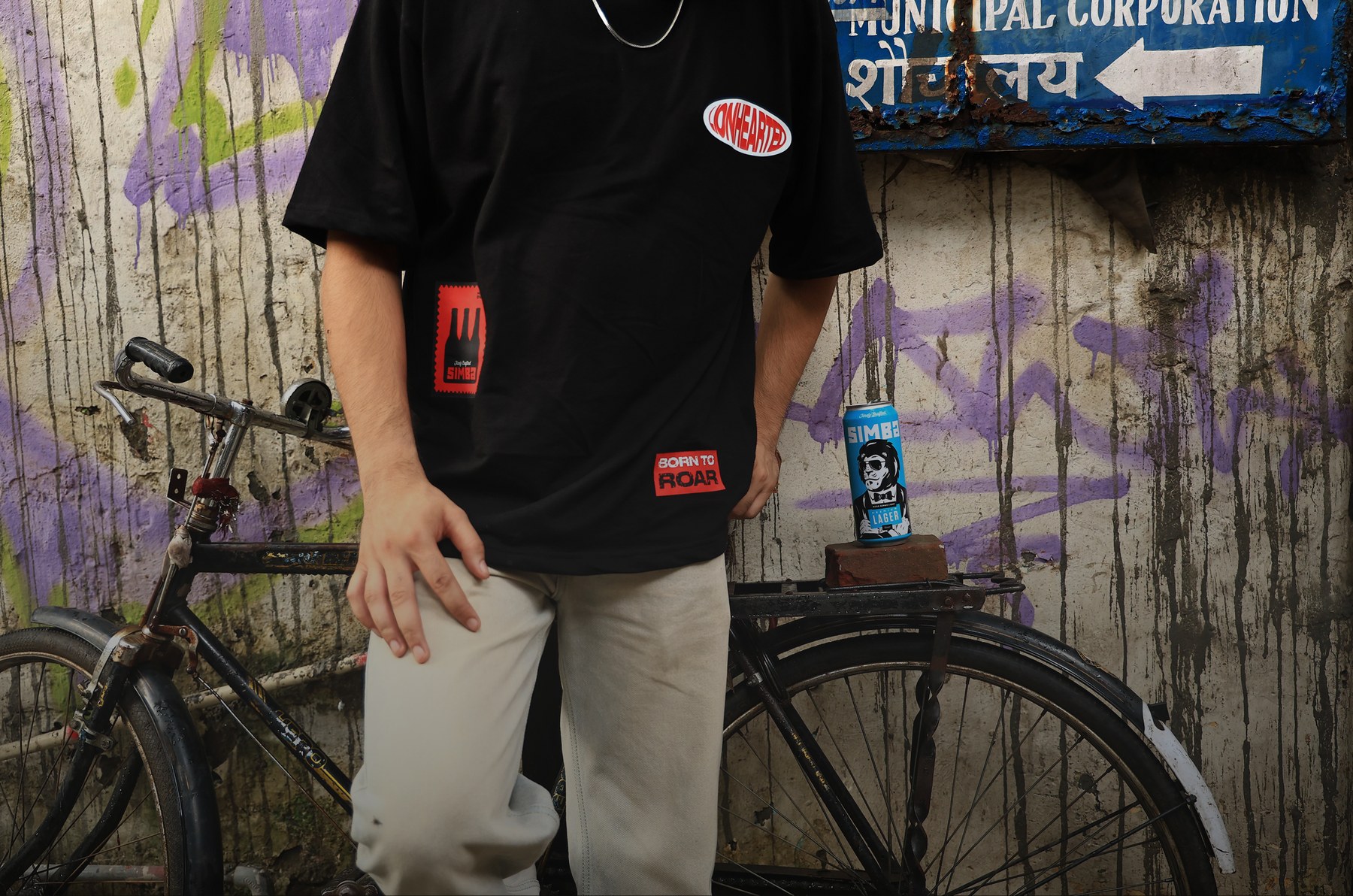
Worn, Not Worn.
Design Strategy
If Simba exists to push craft culture forward, its merch couldn’t just announce the brand. It had to earn a place in someone’s rotation. The brief wasn’t “put the logo on a t-shirt.” It was: design something with enough of its own identity that the Simba connection becomes a discovery, not a headline.
A Street Culture Graphic Language
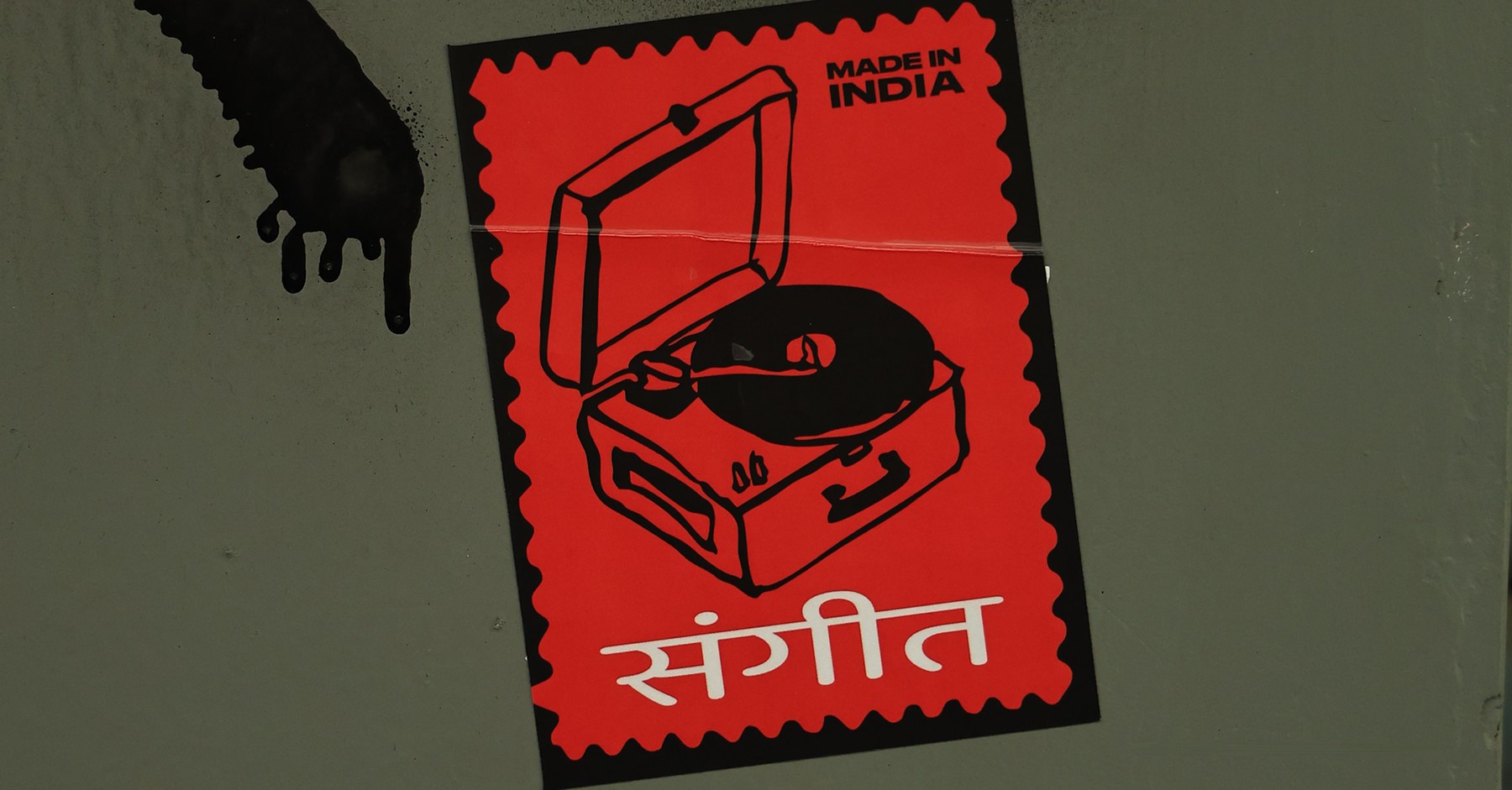
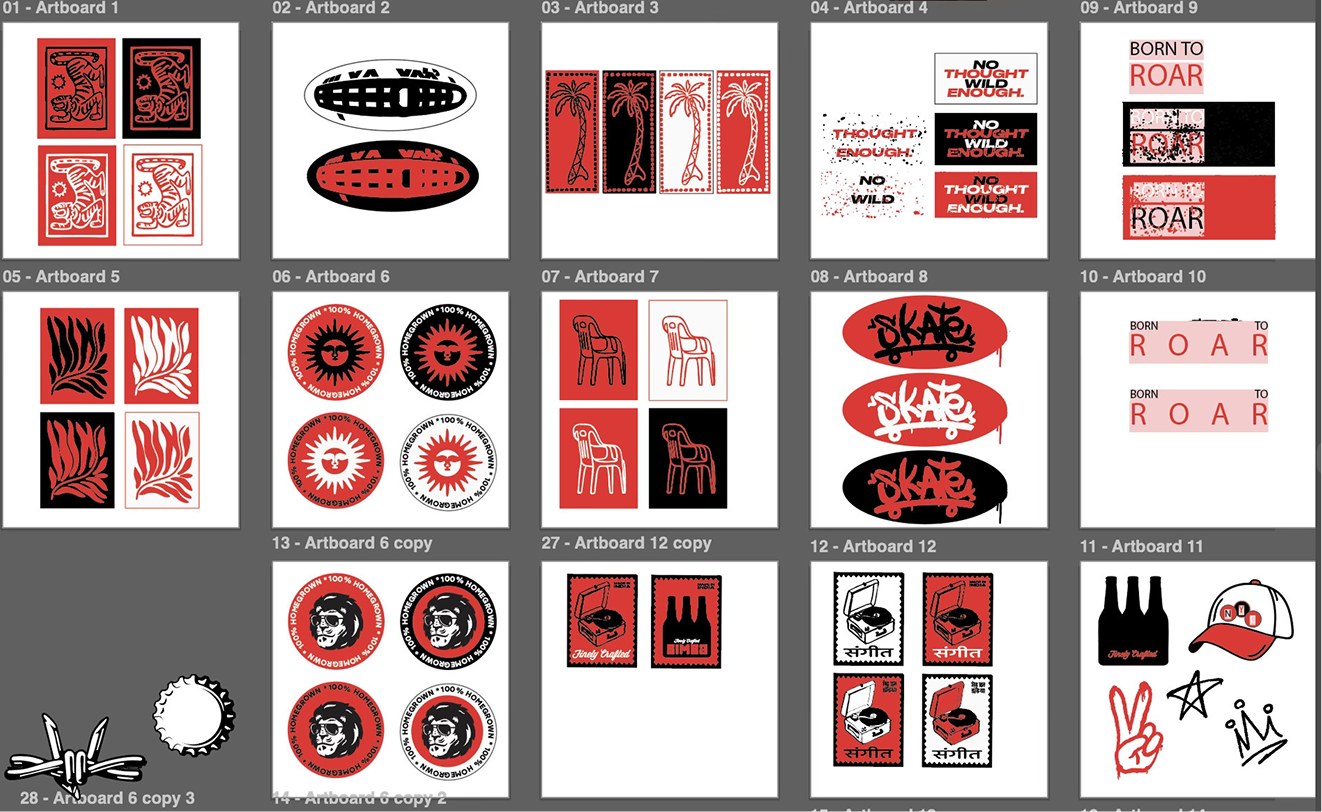
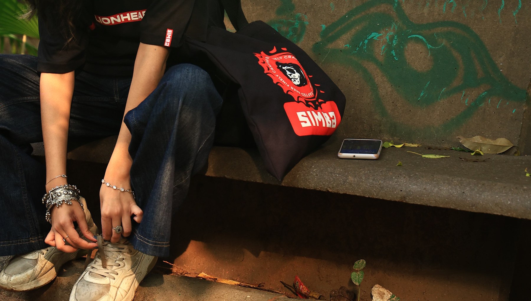
Working from phrases developed with Simba’s content team, the illustrations took shape as a set of patch-style graphics: a ‘Lionhearted’ oval badge, a ‘Born to Roar’ red label, a bottle-cap crown mark on the back, a diamond logo patch, built to function the way street and varsity graphics do, as symbols people collect and combine, not a single fixed design. Early directions leaned into Indian domestic and tropical imagery (plastic patio chairs, palm trees, sun motifs referencing Simba’s presence in Goa) but these read as decorative rather than earned; they gestured at culture instead of building one. The patch system was what stuck, because it gave the brand its own visual vocabulary instead of borrowing someone else’s.
Material & Process
I used Adobe Illustrator to make the graphics, and then took them to photoshop to make mock ups of different placements on the tee. The team then gave their feedback, until they selected the final one.
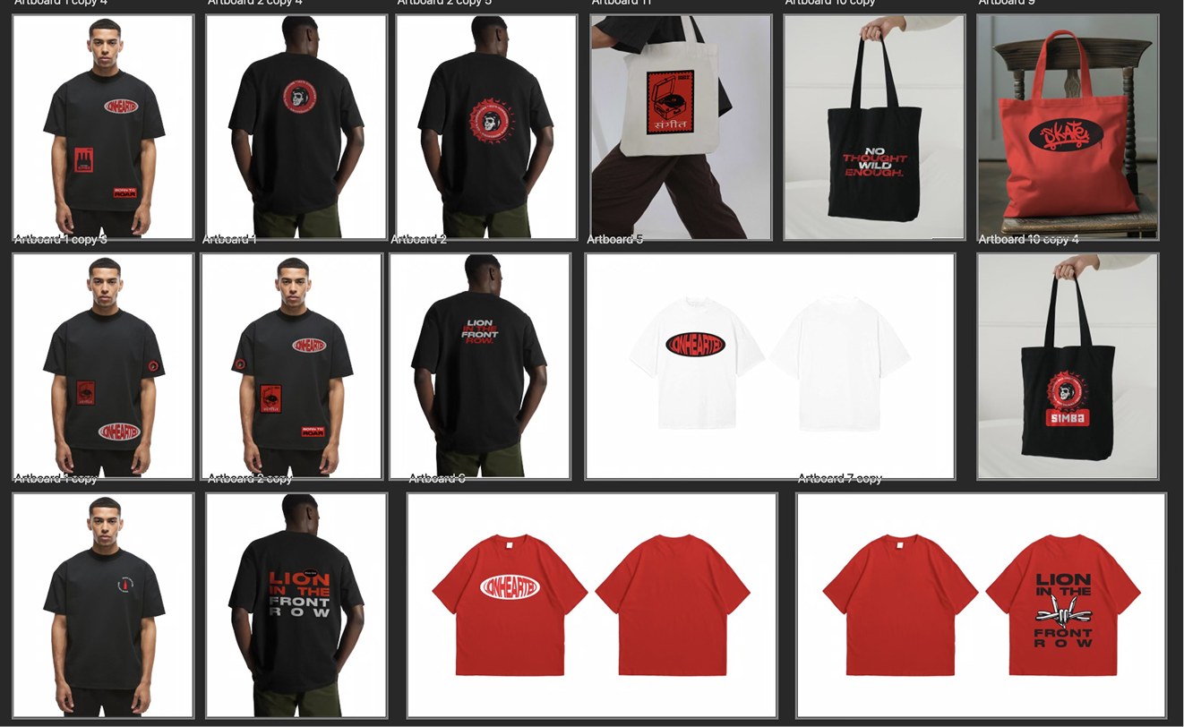
The illustrations were designed first as a flexible asset system, then applied across the tee, a tote bag, and stickers. Each piece using the graphics differently rather than repeating one layout. Eventually, the illustrations printed as stickers became go-to branding assets for all teams and any collaterals that they needed to get made. Simple, and efficient.
Outcome
The bottle-cap crown graphic on the back of the tee, and the tote bag went on to become one of Simba’s most reused brand assets over the following year. The merch itself shipped: worn by the events team at every activation since, included in new-employee welcome kits and select PR kits, with a public release planned for the year ahead.